Saturday, 11 October 2014

My 3d model

As I've shared about my classmates' works in the previous post. I want to talk about my own here.

A rich man's death. 
The juxtaposition of permanent and impermanent materials represent the fragility of human life as opposed to imperishable material gold. It portrays the saying that wealth cannot be brought along into the coffin when one dies.

My work is the juxtaposition between permanence and impermanence, the model is placed such a way that a skull in lying in a bed of gold. The paper mache skull emphasizes that human life is impermanent as paper is easily destroyable. Whereas the gold coins are made of gold aluminium foil signifying the permanence of material things that cannot be brought along when one dies as gold is known to be a permanent metal.

Week 11 - Design watches with Fork, Hammer and Pencil and Classmates' works

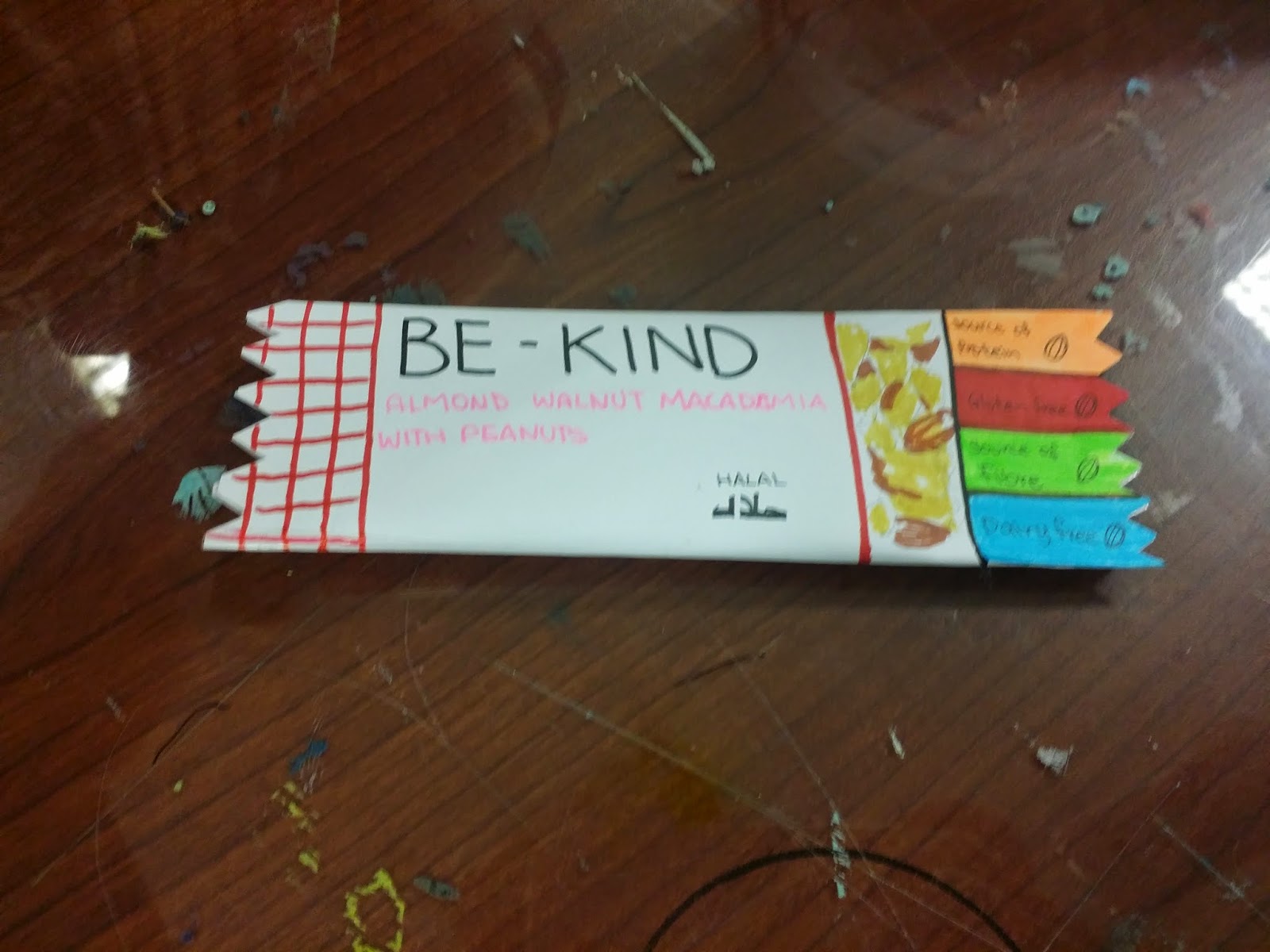
For the final Creative Thinking lesson, we designed watches with 3 objects- Fork, Hammer and Pencil, and a friend in mind that can be represented by that object
 This is a hammer design I drew that represents Claris, I think she is headstrong and also determined to do things her own way, often sturdy and strong like the hammer.

 I made the fork represent Jennifer just for the word play with her name, Jennifork. The end of the strap of the watch is also shaped like the fork!

 The pencil represents Jieyi as she is always accommodating which makes her useful like the pencil.

 Claris- The silver tree, shows juxtaposition between nature and technology. She even added satellites which I think emphasizes the technology better.

 Jieyi's work of juxtaposition show half a cup and a cloth. Juxtaposing materials that is fragile/unbreakable.

 Sherry's work of juxtaposition is the harms aquatic animals suffer from the impact of human use of their body(fur). I think that the color of the dying fish is impactful.

 Safinah's work that represents the consequences of the price of medication. It shows the pain and ultimately death patients that are poor will suffer from.

This is Thurayya's work. Peace vs War.It shows weapons that juxtaposes flowers.

 This is Natalya's work. Needles are dangerous and pain while bed is seen as shelter and comfort. She is portraying someone that is constantly having bad dreams and is afraid to go to bed. The platform is also big to make the bed look cold and lonely.

 This is Wenxin's work. It shows birth vs death. It is interesting as it can be seen in 2 ways. The baby as birth or the flowers as birth (the flowers bloom)

  This is Angel's work of juxtaposition. Needles into heels shows pain vs beauty and the efforts and pains some women will take to look pretty.

This is Insyirah's work. The ferris wheel cages are made to look like prison bars. It portrays one's fear of heights as they feel trapped. Juxtaposing an ideally happy object into one of unhappiness.

 This is Ysabel's work. She used clay to make food like donuts fries and hot dogs in lipstick and compact cushion covers. It shows that the ideal figure of being slim is not important and that everything can be concealed with make up.

Thursday, 2 October 2014

Week 10 - Repackaging


Group members: ClarisJennifer
This week, we had to repackage the item with flawed packaging we found.


This is what we think is a better and more attractive packaging for the potato chips. It is in the form of a potato which is extremely original and has a lid with opening big enough for your hands to reach in, unlike other brands which comes in a can.


Instead of the previous packaging a group made their revised version with a resealable zip and instead of the thin layer of foil they made it more boxy to cushion the crispy seaweed.

This improvised version of the chocomint makes it easier for the consumers to get the chocolate out. I think this is good and practical as I have experienced trouble taking the chocolate out of the current chocomint packaging before

This group created a tearing on this walnut bar (red line across the wrapper) for easier removing of the wrapper.

This is a microwave egg cooker. It holds the egg in a plastic container and you drop the egg in to cook it in the microwave. They made the packaging a chicken as it is relevant to the egg cooker!


This group changed the packaging of cigarettes to encourage smoking instead of the usual gory images shown on cigarette box.

This is a lovely packaging for a tool used for cake decoration is shows the purpose of the item really well and the background is pretty.

Saturday, 27 September 2014

Week 9- Flaws in Packaging

Group members: Claris, Jennifer
We had to find an item with flaws in their packaging. We found potato chips from 7-11 that had packaging that were similar for all flavors! I find that really boring and unappealing towards consumers as the exact same photo of the chips was used for every flavor. Hence, we bought 3 to compare in class.

One of the examples of how they indicate the flavor, just a tiny photo of a chicken skewer (which was supposed to represent BBQ flavor)


Some of the flaws we listed about the packaging.

Friday, 26 September 2014

Week 8- faces in things 2

In addition to the previous post of the class activity - Faces in Things, this is a video I watched sometime back. A few I really like are the lighters at 0:18, they are so cute! Also, the chicken church at 0:47!

Week 8- Faces in Things

This week we had to take photos of faces we see in objects. Initially, I thought this activity would be difficult but I was surprised to realized that I could find faces in things almost everywhere. I gathered all these photos from walking around the school within 30 minutes. This activity made me look at small things in everyday life that was insignificant and went unnoticed most of the time. Many of these 'faces' were even placed perfectly in the position like a smiley. It was interesting to even find them in toilets. This activity ignited my senses and made me ponder over how useful our sight is and it also exercised the brain into work making us more aware of the things around us.

This was the first face I saw, it was left in the exact position of the face and it was extremely to notice it. 
The labels on the doors in the campus made this face.

The screws under the table also makes a face!

Faces I found in the student louge! There were many of them as the room was very furnished and people left the items scattered everywhere

A face on the sides of the walkway

A face on the toilet bowl!

Buttons and Screen on the vending machine

2 plastic bags and a earpiece left lying on the table.

Buttons on my classmate's bag

Monday, 8 September 2014

Week 7 - Sensorium 360

As we enter the exhibition we see these canvases of a series of blurred images that shows what seems like people lying on a bed. It is thought provoking. The artist might have wanted to document the activities on that particular bed as clearer photos were taken of the empty bed too.

This is a room with laser lights as seen in sci fi movies, it was extremely cool to experience it first hand although no alarm sounded when we touched it. However, mist to blur the surrounding to create a darker atmosphere was sprayed every few minutes.

The exhibition was a video that was looping, it shows the process of the canvas being drawn. It was rather creepy as it started of with a normal human face but blood and cuts were then added on making the painting gory.

This person's face was drawn in such a way that it can only be seen clearly from certain angles.

Close up of a huge piece, it was amazing to see the pencil work so detailed.
This was in the room for special exhibitions. After reading about the work, I realised that this work focused on the round orbs(To be seen) and sound from speakers (to be heard) it engages both senses to understand this work .


My classmates leaving a message in the museum!


 The class visited the Sensorium 360 exhibition during class. This exhibition shows works that involve and engage the 5 senses.

Another interesting exhibit that I did not capture in photos was one that allowed you to look at yourself from a cctv view? There was also a series of art work that caught my attention, the concept was rather creepy as the artist tried to portray blood and other mortifying pictures, the same artist displayed had a few canvases which were paintings of people but were painted over with glue or something to create a whole new work.